
Ready to rock the ParaPro Reading test? Our guide makes graphs and charts super clear, so you can crush questions!
What Are Graphs & Charts?
Graphs and charts use pictures, like bars or lines, to show data fast. On the ParaPro test, you’ll see visuals—like a graph of class games or a chart of quiz scores—and answer questions about what they mean. You might find the main point or spot key info.
This skill helps you teach kids to read data, like their homework points, in a fun way. It’s key for awesome paraprofessionals!
Why Graphs & Charts Matter
About 3-6 of the 30 reading questions use graphs or charts. They test how quick you can spot key info, like the highest bar or a rising line. For example, a chart about class snacks might show what’s most liked.
In class, you’ll use graphs to help kids see data, like tracking their reading, making lessons a blast!
Types of Graphs & Charts
Here’s what you’ll see on the test, with tricks to ace them:
- Bar Graph: Bars show amounts, like votes for sports. Look at the tallest bar to compare.
- Pie Chart: Slices show parts, like favorite toys. Check the largest slice.
- Line Graph: Lines show changes, like test scores. See if the line goes up or down.
Mastering these makes test questions a breeze!
Reading and Analyzing Visuals
On the reading exam, you’ll likely get a visual—like a graph, chart, or diagram—and need to draw a conclusion based on its contents. If you’re new to common types, check the Data Analysis page of our Math Study Guide. Study the graph first and form your own idea before seeing the answer choices.
Read the visual and question carefully. Many mistakes happen when you miss key details. Always double-check your answer to stay sharp!
Easy Steps to Read Graphs & Charts
Here’s how to nail graphs and charts like a pro:
- Read the title and labels to get what’s shown.
- Spot the highest bar, largest slice, or top number fast.
- Look for trends, like a line going up or a bar standing out.
- Say the main point, like “Soccer got the most votes.”
- Think, “How would I explain this to a kid?” to stay clear.
Test tip: Focus on the main idea—don’t fall for tricky options!
Examples
Example 1: Grand Slam Titles
Directions: Use the chart below to answer the following question.
The chart shows the number of Grand Slam titles won by male tennis players.
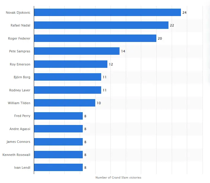
Question: What conclusion can be drawn from the graph above?
- A) All players listed have won more than 10 Grand Slam titles.
- B) Roger Federer has won more titles than Novak Djokovic.
- C) Novak Djokovic holds the record for the most Grand Slam victories.
- D) Pete Sampras and Rafael Nadal are tied in Grand Slam wins.
Correct Answer: C) Novak Djokovic holds the record for the most Grand Slam victories.
Explanation: The chart clearly shows Novak Djokovic at the top with 24 Grand Slam titles, more than any other player listed. Roger Federer and Rafael Nadal follow with 20 and 22 respectively. Other options are factually incorrect based on the data shown.
Example 2: Weekly Math Scores
A line graph titled “Weekly Math Scores” shows scores over time. Week 1: 60 points; Week 2: 65; Week 3: 70; Week 4: 75. The line rises steadily.
Question: Is it true that scores went up?
- A) False, scores stayed the same
- B) True, scores went up
- C) False, scores went down
- D) True, no scores changed
Answer: B) True, scores went up.
Why? The line graph shows scores rising from 60 to 75. Test tip: Follow the line to see the trend—double-check to stay accurate!
Ready to test your skills? Try our graphs & charts quiz below to practice more!
Frequently Asked Questions
How do I read graphs fast on the test?
Skim the title, then find the highest bar or largest slice. Tip: Focus on the main point to save time!
Are graph questions tough?
Not if you practice! Look for key details. Tip: Cross out answers that don’t match the data!
How many graph questions are there?
About 3-6 out of 30 reading questions. They’re common! Tip: Use our free practice tests to get set!
Will this help me teach kids?
Yes! Graphs help you show kids data, like their scores. Tip: Practice explaining the main idea!
Where can I practice more?
Our site has free ParaPro tests with graph questions. Try books with charts too! Tip: Look at data daily to stay sharp!